
3 | The operating system scan: getting a grip on what to fix

Who this post is for: Leaders who sense their organization slowing down, accept the cause is systemic, and want to find out where specifically to start.
TL;DR:
- Sensing the coordination headwind is easy, locating its cause is not; scan your operating system before you rebuild anything (diagnose before you prescribe)
- Scan the six operating system elements through three lenses each: design (do you know how it should look), awareness (does everyone share it), and execution (do you live it)
- The same element can be weak in three different ways, each needs a different fix: build it if design is weak, communicate it if awareness is weak, or clear blockers if execution is weak
- Score (green, yellow, red) by relative pain, not absolute quality: keep red scarce to force the comparison of what hurts most rather than creating a long issue list
- Then act: pick one red, ask what would turn it yellow this quarter, and finish it before starting to work on the next
As your organization grows, it gets harder to run. It slows down, focus and alignment fade, and people start saying "them" instead of "us" about their own colleagues. In the previous post, I called this the "coordination headwind" and shared that this is not a people or hiring issue: your company has outgrown its informal ways of working.
Sensing the headwind is easy. Knowing what to do about it is not. As mentioned in that previous post, acknowledging the headwind, talking about (common) goals, and enabling teams to work independently almost always help. But to really get a grip on what needs fixing to counter the coordination headwind, you should scan your organization's current operating system. Diagnose before you prescribe.
"Every system is perfectly designed to get the results it gets." – W. Edwards Deming
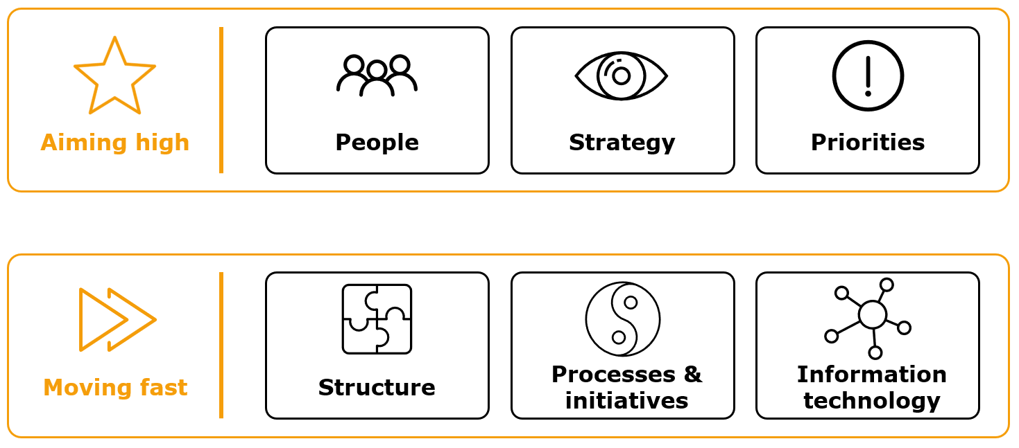
Every company runs on an operating system, whether it was designed or just grew: how it sets direction, decides, organizes, and gets work done. I use a six-element version, introduced in the first post: people, strategy, priorities, structure, processes & initiatives, and information technology.
The three lenses
To understand the state of an operating system element, one score is not enough. An element can be weak in three quite different ways, and each calls for different work. So instead of asking "how are we doing on priorities?", ask three separate questions:
- Design: Do we know how this should look?
- Awareness: Does everyone share that understanding?
- Execution: Do we live it in practice?
These are not steps you go through in order. They are three different ways of looking at the same element, and each can be fine or broken on its own.
Design is about what should exist: the agreed way you do a thing. The design is weak if there is no shared or only a very rudimentary answer. There is no common way of setting goals, so every team invents its own or just operates without one. Or nobody can say who decides what, so the same question gets routed to three different people depending on who you ask.
Awareness is about who actually knows the design. Awareness is weak if something exists on paper but not in people's heads. A strategy was defined and presented once, but ask five people what it says and you get five answers (including a few blank stares). Or the values are on the wall, yet people struggle to even name a few.
Execution is about what happens day to day. Execution is weak if the design is known but not lived. OKRs get written every quarter and are never opened again until the review. Or the onboarding process is documented and skipped under time pressure every single time.
Awareness and execution are judged against what you actually have, not against some ideal. A basic, even somewhat broken design that everyone knows and follows is a real and decent place to be. Do not score awareness and execution low just because the design is not great. Ask instead: do people understand the few things we have, and do they live them?
Looking at the three together is also very useful, because the combinations tell you different stories:
- Design without awareness: it exists, in a deck nobody has opened.
- Awareness without execution: people can recite it, but nobody really lives it.
- Execution without design: it works, but only because a few people carry it in their heads, and it will probably break when they leave.
The reason to separate the three lenses is that the fix is different in each case. A red in design means you have to build the thing: agree on the approach, write it down. A red in awareness means you have to communicate: make it more practical, repeat it until it sticks. A red in execution means you need to find out why the design is not lived: is something blocking people, or does an easier alternative keep winning?
Running the scan
Six elements, three lenses. Everything about how your organization runs (how it sets direction, decides, organizes, and gets work done) sits somewhere in those 18 boxes. Together, they create a heatmap of where your operating system supports you and where it holds you back.
If necessary, you can complete a first pass in less than half an hour on your own. But I recommend you take more time than that (I am obviously biased) and ideally go through it together with your team.
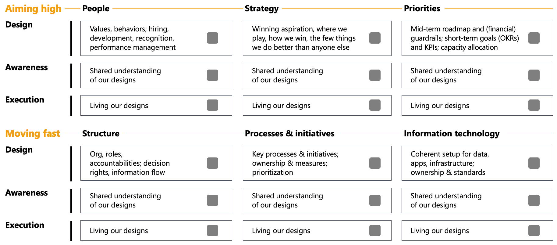
The goal is to pick one color for each of the 18 boxes:
- Green: fine for now, maybe even a strength
- Yellow: some issues here, but they hurt less than others
- Red: this is what hurts us most right now
The colors are relative. Which boxes hurt more than the others is what you can act on, and it is also the easier question. "Is our goal setting good?" is hard to answer. "Does it hurt more than structure?" is much easier.
Keep red scarce. Even if many boxes need work, try to keep to three reds. If you end up with more, ask: "Are these all equally painful, or do a few really stand out?" Forcing this comparison is what turns a wall of concerns into something you can start working with.
Going deeper
How you arrive at the coloring depends on two things: how many people you involve, and whether you only talk to them or also look at the artifacts.
How many people to involve: The quickest version is an individual review: 18 boxes, half an hour, your own read. The next step is to have your team each color the scan alone, then compare. The disagreements between their sheets will create very valuable discussions. The most thorough version reaches beyond your team and includes other key stakeholders, both vertically (your boss, people reporting to your team members) and horizontally (key contacts in other departments, or even people you work closely with at customers, partners and suppliers). You know you have interviewed enough people when new conversations stop changing colors on your heatmap.
Whether to also look at artifacts: Talking to people tells you what they believe is true. Looking at the actual documents tells you what is actually there, and the gap between the two is often an interesting finding. Someone assures you there is a robust goal-setting process. You search for documents and find half a page from two years ago that nobody has opened since. This changes your answer on where goal-setting probably stalls (not in awareness, but in design).
Artifacts worth looking at, by OS element:
- People: values / behaviors page, hiring and performance management processes
- Strategy: strategy documents (the complete version and what is shared company-wide)
- Priorities: goal system, KPI dashboards, (product) roadmaps, financial planning documents
- Structure: org chart, role descriptions, documented decision-rights and information sharing approaches, operating rhythm / management calendar
- Processes & initiatives: process inventory / landscape (plus the documentation for the most important ones), key initiative list and documentation on their current state
- IT: data catalog / governance, application landscape, infrastructure architecture
You do not need all of this to start. A quick individual review may already give you a usable picture. You may even decide to combine the approaches, based on your familiarity with a topic. For areas you know well, your own read may be enough; where you know less, you talk to additional people and review the documents.
If a box feels unclear or too broad, you can dive deeper with the extended question list below. This should give you a better understanding of what each element contains.
A last point on cadence: this is a one-off exercise, not a standing meeting. If you run it and act on what it surfaces, the results will keep you busy for a while (more likely years than months). Run it again when you have fixed the reds, or when the organization has changed enough that the old picture no longer fits: headcount has doubled, the leadership team has changed significantly, or the strategy underwent a major update.
Reading the result: Vektor
To make this concrete, here is a filled scan for a fictional company called Vektor. Vektor is a deep-tech scale-up building force-torque sensors for industrial robots. It grew from around 40 to 120 people in two years. The founders still run it, and most of the leadership team grew into their roles rather than being hired into them. Everyone senses the organization has become slower and less aligned, but nobody can quite say where the problems lie. So they ran the scan.
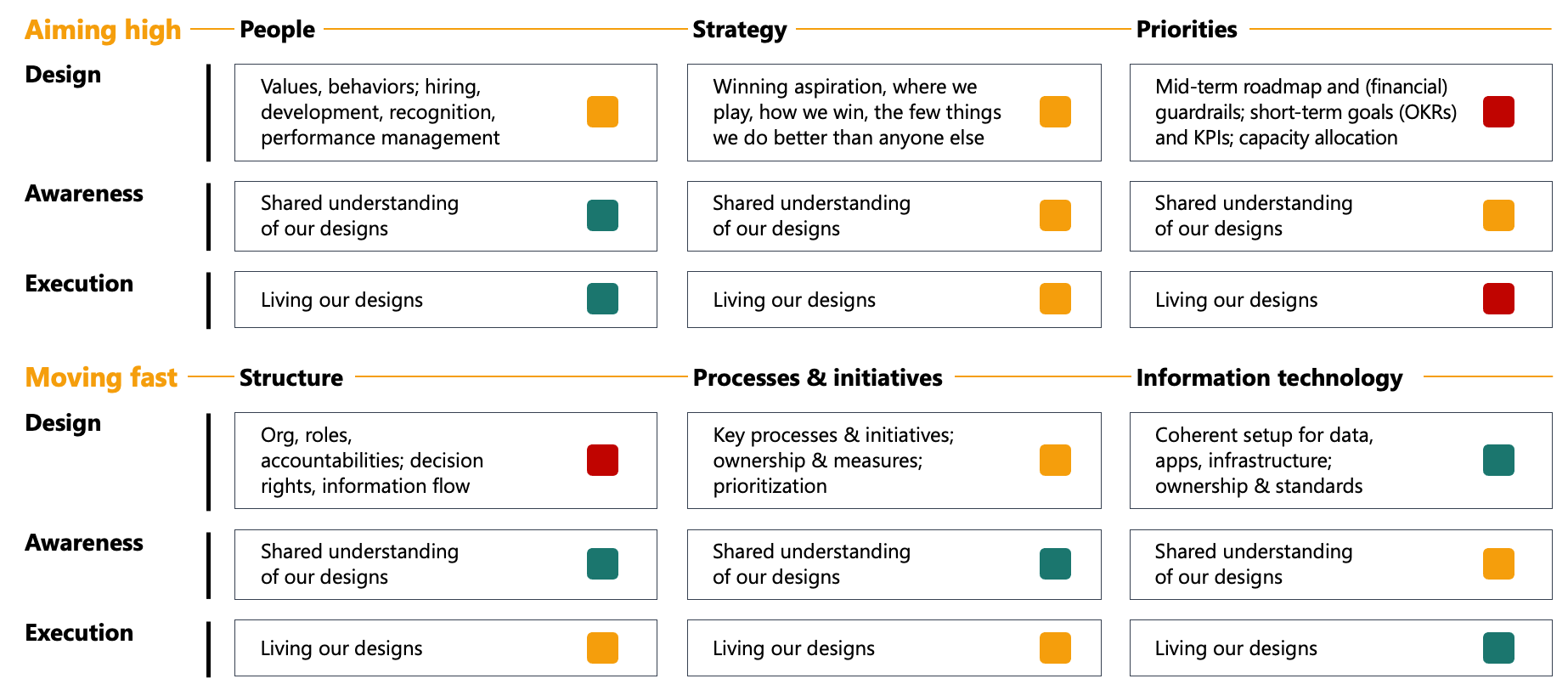
Almost nothing is fully green, and that is quite normal. Very few companies (at any size, not just scale-ups) are set up in a way that people can honestly say "this works very well". The point is not to fix all of it. It is to find where it hurts most. For Vektor, that is clear enough.
The biggest issues lie in priorities. There is no shared way of setting goals, capacity is chronically over-committed, and the goals that do exist do not steer what teams work on in a given week. Design and execution are both red, and the second follows from the first: with no agreed way to set goals, nobody treats the goals as binding, so the week fills with whatever feels like the biggest fires.
Close behind is structure. As Vektor grew, the org, the decision rights, and the operating rhythm did not keep pace, turning the design red. What is defined (the org chart and the management calendar) everyone knows and follows. The problem is what is missing: decision rights were never written down, and the rhythm still assumes 40 people. So people improvise around the gaps and increasingly do it their own way. This is where (some of) the "us vs. them" feeling comes from.
Priorities and structure are the main points. A handful of other things showed up as yellow and are worth naming (but should only be tackled after fixing goals and structure):
- Strategy is shaky, mostly because it was never sharply defined, not that clearly communicated, and only inconsistently acted on. Vektor can live with that for now.
- Processes & initiatives has two different problems. On the process side, the process landscape is documented but has gaps, and people are not yet used to following what is there. On the initiative side, non-technical projects are run off a couple of evening emails, often without a clear owner, so they stall and pile up without ever properly creating results.
- People is mostly fine for now. Not much of the talent system is deliberately designed yet, but people follow the few things that are. Performance management is the next piece to build when there is capacity.
- Information technology is Vektor's strongest element, thanks to an early, capable owner who took it seriously. Some of his (very good) setups for data and applications are not yet that well-known across Vektor, creating the occasional confusion about what to use and where data lives. Apart from that, Vektor's IT is in good shape for now.
Reading Vektor is easy because nobody at Vektor is in the room. Reading your own organization is harder: a red box gets interpreted as someone's area, and is then easily seen as a verdict on them. It is not. Red marks show where the system needs improvement, not where a person failed. Discuss the scan with your team in that spirit.
Deciding what to fix
Once you have completed the scan, make sure you act on it. Start with one red box that is both important and changeable, and ask a deliberately modest question: what would it take to turn this from red to yellow within the next quarter? Not to green, not perfect, just meaningfully less painful. That will keep the goal concrete and reachable. Yellow is enough, because you will be back: as the company grows, the same element will need another pass.
Do not try to fix too many things at once. Most organizations have quite limited capacity to drive and absorb change. It is better to complete one improvement than to start five that go nowhere. Stop starting, start finishing.
One of the reasons you want to focus is that change is hard. Finding and addressing issues is one thing, but helping people move forward on them together is a lot tougher. This is why most change efforts fail. It is its own craft, and Kotter's "leading change" is the best map I know: build urgency, get a coalition behind it, show quick wins early, keep going until it sticks. More on that in a later post.
Block time for this work. No one will hand you the hours for these improvements, you have to claim them yourself.
For Vektor, the choice is straightforward. Of the red areas, designing priorities should come first. Clear goals are the fastest to put in place, they need no reorg and no offsite, and they will give the teams something to align around. So goals are where Vektor starts, and, conveniently, where the next post will go.
Further reading
- Where to stash your organizational risk by Will Larson: An overview on organizational debt, risk, and what to tackle vs. leave for now
- Leading change by John Kotter: The classic on why change efforts fail and the eight steps to make them stick
- Our iceberg is melting by John Kotter: Kotter's framework conveyed in a fable about fear of change and how to motivate people to take action, all while talking about penguins :)
I value feedback. If you see something worth challenging or improving, feel free to reach out on LinkedIn. I treat these posts as living documents and will update them over time.